Best YouTube Thumbnail Examples (High CTR & Viral Designs)
See how small design changes turn forgettable thumbnails into click magnets. Below you'll find real before-and-after transformations, the exact patterns that push CTR past 10%, and the visual rules top creators use to pull millions of views.
Want to build one yourself? Open the free thumbnail editor and create your own thumbnail in under two minutes. No signup, no watermark, no uploads to a server.
Try Free EditorWhat Makes a High CTR Thumbnail?
A high-CTR thumbnail stops the scroll. It communicates the video's emotional core in a quarter-second, then makes you need to click. The best ones follow a repeatable formula, which is exactly why viral designs share the same visual DNA across every niche, from gaming to finance to vlogs.
Every thumbnail that outperforms its channel average has these five traits:
- Strong emotion. Shock, joy, disgust, or curiosity on a face, in the title, or in the color palette.
- High contrast. Bright subject against a darker background. Colors that fight each other for attention.
- Minimal text. Two to four punchy words, readable on a phone at 200 pixels wide.
- Clear subject. One focal point. No competing elements splitting the viewer's eye.
- Curiosity gap. A visual or textual promise that can only be resolved by clicking.
Viral Thumbnail Examples (Before vs After)
Each example below pairs an underperforming thumbnail with its redesigned version, then breaks down exactly what changed and why it moved the numbers. Use these as templates for your own rework.
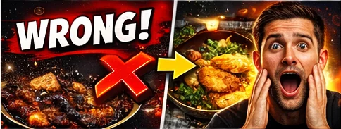
Example 1
Low CTR to High CTR Transformation
CTR Impact: 2.8% → 9.4%
Why it works:
- Subject pulled forward and cropped tight so facial emotion reads instantly.
- Background darkened and desaturated to push contrast against the face.
- Text reduced from a full sentence to three bold words.
- Warm color accent added to direct the eye to the focal point.
- Outline stroke added to the text so it stays legible on any device.
Recreate this look: open the free thumbnail editor, drop in your image, and apply the Bold Pop preset.
Example 2
Cluttered Thumbnail Rebuilt for Clarity
CTR Impact: 3.1% → 11.2%
Why it works:
- Five competing elements cut down to one clear subject.
- Negative space introduced so the viewer's eye has somewhere to rest.
- Circular highlight added around the key object for instant focus.
- Font changed to a thick display face that holds up at mobile sizes.
- Color palette narrowed to three shades to stop visual fatigue.
Recreate this look: use the thumbnail editor and apply the red circle highlight to your focal point.
Example 3
Boring Face to Shock Reaction
CTR Impact: 4.0% → 13.7%
Why it works:
- Neutral expression swapped for an exaggerated reaction shot.
- Zoom increased so the face fills 60% of the frame.
- Eye contact centered to lock the viewer in.
- Title overlay moved off the face and into empty background space.
- Subtle drop shadow added behind the face to separate it from the backdrop.
Recreate this look: edit your thumbnail now in the free editor and try the Drop Shadow text effect for instant depth.
Example 4
Weak Text to Bold Headline
CTR Impact: 2.5% → 8.9%
Why it works:
- Word count cut from twelve to three.
- Thin font replaced with a heavy condensed typeface.
- Key word highlighted in a contrasting color for emphasis.
- Text positioned inside the safe zone so it survives the timestamp overlay.
- Stroke thickness doubled so letters stay readable at 200px wide.
Recreate this look: head to the thumbnail editor and use Quick Text with per-word color emphasis. Pick the right font for your niche first.
Example 5
Flat Image to Split-Screen Comparison
CTR Impact: 3.3% → 10.6%
Why it works:
- Single image rebuilt as a before-and-after split that teases a result.
- Vertical divider adds structure and implies a comparison to be resolved.
- Green and red color coding taps into instinctive good-versus-bad pattern recognition.
- Arrow added between halves to tell the viewer exactly where to look.
- Short overlay label on each side makes the payoff explicit in one glance.
Recreate this look: use our before and after image tool to build a split-screen thumbnail in seconds.
Why These Thumbnails Go Viral
Emotion Drives Clicks
Human brains scan faces before anything else. A surprised, angry, or ecstatic expression signals that something unusual happened, and that signal is what creates the pull to click. Neutral faces are invisible. Exaggerated ones convert.
Contrast Increases Visibility
YouTube's home feed is a wall of thumbnails competing for the same half-second of attention. High contrast between subject and background is the single cheapest way to win that competition. Bright yellows, oranges, and whites pop hardest against darkened backdrops.
Curiosity Creates Clicks
The best thumbnails show you 80% of the story and hide the 20% you need to know. An arrow pointing at something just off-frame. A blurred object. A reaction with no context. The gap between what you see and what you want to know is the click.
Simplicity Wins
Every extra element splits attention and dilutes the message. One subject, one emotion, one headline, one color accent. Thumbnails that look simple at a glance always outperform busy designs, even when the busy version contains more information.
High CTR Thumbnail Styles You Can Copy
These five templates work across almost every niche on YouTube. Pick the one that matches your video's emotional core and build from there.
Reaction + Object
A large reaction face paired with the subject of the video (a product, a result, a screenshot). It works because the face tells the viewer how to feel, and the object tells them what the video is about, all in the same glance.
Before vs After
Split the frame down the middle with a clear transformation on either side. This taps into an instinctive curiosity about outcomes. The viewer has to click to find out how the change happened.
Big Text + Face
Two or three oversized words paired with a tight reaction shot. Works because the text filters for intent (viewers who care about the topic) while the face drives the emotional pull.
Circle and Arrow Highlights
A red circle or bright arrow directing the eye to a specific detail in the image. Works because it hijacks visual attention instantly, and it implies there's something important the viewer might otherwise miss.
Zoomed Detail
Crop in so tight that the subject becomes abstract or mysterious. Works because the viewer cannot immediately identify what they're looking at, and that cognitive gap demands a click to resolve.
10 Viral Thumbnail Patterns
Ten real high-CTR patterns, one per card. Each one uses a tested combination of emotion, contrast, and curiosity. Study the pattern, then copy the structure into your own thumbnail with the editor.
Recreate any pattern in the free editor →
Create Your Own Thumbnail
Every technique on this page is one click away. Open the free thumbnail editor in your browser, drop in any image, and apply the same text effects, circles, arrows, and reaction crops that power the viral examples above.
If you're starting from scratch, the YouTube thumbnail preview tool helps you see how the 1280 by 720 design will look on mobile, desktop, and sidebar before you publish. And if you're rebuilding an existing thumbnail, the before and after comparison tool lets you stack your old design next to the new one so you can see the improvement before you ship.
FAQ
What is a good CTR for YouTube thumbnails?▼
The YouTube average sits between 2% and 10%. Anything above 6% is considered strong, and top-performing videos regularly push past 10%. New channels often sit at 2 to 4% until they dial in their thumbnail style.
What size should thumbnails be?▼
YouTube requires 1280 by 720 pixels at a 16:9 aspect ratio, saved as JPG, PNG, GIF, or WebP, and under 2MB in file size. Staying at or close to this spec ensures your thumbnail stays crisp across desktop, mobile, and TV.
Full size guide →Do thumbnails really affect views?▼
Yes, significantly. A strong thumbnail can increase CTR by 2 to 5 times, which directly compounds into more impressions from YouTube's algorithm. Most creators see bigger gains from thumbnail changes than from video edits or title tweaks.
How do I test which thumbnail performs best?▼
Use YouTube's built-in thumbnail A/B testing inside YouTube Studio for videos with sufficient traffic, or
preview two versions side by side before uploading to catch obvious losers early. Judging thumbnails at actual feed size, not at 1280 pixels wide, is the fastest way to spot problems.
Helpful YouTube Thumbnail Tools